完全に趣味の誰得CSS!
FontAwesomeのアイコンフォントにオリジナルCSSアニメーションをつけて、LINEスタンプっぽいものを作ってみました。
120px×120pxの小さな領域内で、アイコンに躍動感を与えるチャレンジ!
FontAwesomeの最新版(2024年8月現在)
head内に挿入
<link rel="stylesheet" href="https://cdnjs.cloudflare.com/ajax/libs/font-awesome/6.6.0/css/all.min.css">
このコードを<head>と</head>の間に挿入すると、Font Awesome6.6.0のアイコンが使えるようになります。2024年8月現在、これが最新版です。
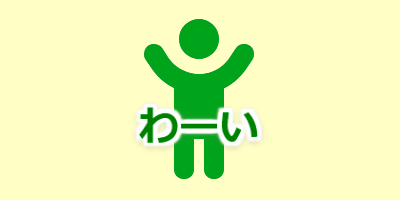
ひかえめな「わーい」
わーい
丸いアイコンにアレンジ
わーい
背景色を設定しborder-radiusで角に丸みをつければ、こんな風な丸いスタンプになります。
ソースコードを見る
HTMLコード
<div class="linestamp-01">
  <i class="fa-solid fa-child-reaching"></i>
  <span class="text-01">わーい</span>
</div>
CSSコード
.linestamp-01 {
  position: relative;
  display: flex;
  align-items: center;
  justify-content: center;
  height: 120px;
  width: 120px;
  overflow: hidden;
}
.linestamp-01 i {
  font-size: 80px;
  color: #00a41a;
  animation: icon-animation-01 2s infinite;
}
.linestamp-01 .text-01 {
  position: absolute;
  bottom: 30px;
  left: 0;
  right: 0;
  text-align: center;
  font-weight: bold;
  font-size: 20px;
  color: green;
  text-shadow: 2px 2px 1px #fff, -2px -2px 1px #fff, -2px 2px 1px #fff,
  2px -2px 1px #fff, 0 2px 1px #fff, 0 -2px 1px #fff, -2px 0 1px #fff,
  2px 0 1px #fff, 0 0 5px rgba(255, 255, 255, 0.7), 0 1px 4px #000;
  animation: text-01 2s infinite;
}
@keyframes icon-animation-01 {
  0%, 10%, 20% { transform: translate(0px, 2px); }
  5%, 15%, 25% { transform: translate(0px, -2px); }
  30%, 100% { transform: translate(0px, 0px); }
}
@keyframes text-01 {
  0%, 30%, 100% { transform: scale(1); }
  5%, 15%, 25% { transform: scale(1.05); }
  10%, 20% { transform: scale(0.98); }
}
丸いアイコンver.は、8行目と9行目の間にbackground: #ee2; border-radius: 50%;を入れています。笑い転げる「はっはっは!」
はっはっは!
イヤな奴にアレンジ
ww草ww
アイコンを黒に、テキストを緑の草に変えると、イヤな奴になります。
ソースコードを見る
HTMLコード
<div class="linestamp-02">
  <i class="fa-solid fa-face-grin-squint-tears"></i>
  <span class="text-02">はっはっは!</span>
</div>
CSSコード
.linestamp-02 {
  position: relative;
  display: flex;
  align-items: center;
  justify-content: center;
  height: 120px;
  width: 120px;
  overflow: hidden;
}
.linestamp-02 {
  position: relative;
  display: flex;
  align-items: center;
  justify-content: center;
  height: 120px;
  width: 120px;
  overflow: hidden;
}
.linestamp-02 i {
  font-size: 60px;
  color: #ffd700;
  position: absolute;
  animation: icon-animation-02 1.5s cubic-bezier(0.65, 0.05, 0.36, 1) infinite;
}
.linestamp-02 .text-02 {
  position: absolute;
  bottom: 10px;
  left: 0;
  right: 0;
  text-align: center;
  font-weight: bold;
  font-size: 16px;
  color: #ff4500;
  text-shadow: 2px 2px 1px #fff, -2px -2px 1px #fff, -2px 2px 1px #fff,
  2px -2px 1px #fff, 0 2px 1px #fff, 0 -2px 1px #fff, -2px 0 1px #fff,
  2px 0 1px #fff, 0 0 5px rgba(255, 255, 255, 0.7), 0 1px 4px #000;
  animation: text-02 0.1s ease-in-out infinite;
}
@keyframes icon-animation-02 {
  0%,
  100% {
    left: 0;
    transform: rotate(-25deg);
  }
  50% {
    left: calc(100% - 60px);
    transform: rotate(120deg);
  }
}
@keyframes text-02 {
  0% {
    transform: scale(1, 1);
  }
  50% {
    transform: scale(0.95, 0.93);
  }
}
リズミカルな「イェーイ!」
イェーイ!
ダンシングベイビーにアレンジ
イェーイ!
赤ちゃんのアイコン<i class="fa-solid fa-baby"></i>に差し替え、角丸のボーダーで囲んでみました。
ソースコードを見る
HTMLコード
<div class="linestamp-03">
  <i class="fa-solid fa-face-grin-stars"></i>
  <span class="text-03">イェーイ!</span>
</div>
CSSコード
.linestamp-03 {
  position: relative;
  height: 120px;
  width: 120px;
  overflow: hidden;
}
.linestamp-03 i {
  position: absolute;
  font-size: 70px;
  color: #FFD700;
  animation: icon-animation-03 0.6s cubic-bezier(0.5, 0, 0.75, 1) infinite;
}
.linestamp-03 .text-03 {
  position: absolute;
  bottom: 10px;
  left: 0;
  right: 0;
  text-align: center;
  font-weight: bold;
  font-size: 18px;
  color: #FF6347;
  text-shadow: 2px 2px 1px #fff, -2px -2px 1px #fff, -2px 2px 1px #fff,
  2px -2px 1px #fff, 0 2px 1px #fff, 0 -2px 1px #fff, -2px 0 1px #fff,
  2px 0 1px #fff, 0 0 5px rgba(255, 255, 255, 0.7), 0 1px 4px #000;
  animation: text-03 0.1s ease-in-out infinite;
}
@keyframes icon-animation-03 {
  0%, 100% {
    bottom: 10px;
    left: 25px;
  }
  25% {
    bottom: 50px;
    left: 50px;
    transform: rotate(30deg);
  }
  50% {
    bottom: 10px;
    left: 25px;
  }
  75% {
    bottom: 50px;
    left: 0px;
    transform: rotate(-30deg);
  }
}
@keyframes text-03 {
  0% { transform: scale(1, 1); }
  50% { transform: scale(0.9, 0.93); }
}
丸角縁取りアイコンver.は、5行目と6行目の間にbackground: #fff; border-radius: 30%; border: 5px solid pink;を入れています。
荒ぶる「ひゃっはー!」
ひゃっはー
動きが複雑すぎて、環境によってはカクつくかも。
雪山風にアレンジ
ひゃっはー
背景に斜めのグラデーションを入れ、寒い雪山を演出してみました。アイコンのサイズを50pxから68pxにアップさせ、ちょっと領域からはみ出る感じに。
ソースコードを見る
HTMLコード
<div class="linestamp-07">
  <i class="fa-solid fa-person-snowboarding"></i>
  <span class="text-07">ひゃっはー</span>
</div>
CSSコード
.linestamp-07 {
  position: relative;
  height: 120px;
  width: 120px;
  overflow: hidden;
}
.linestamp-07 i {
  position: absolute;
  font-size: 50px;
  color: #1e90ff;
  animation: icon-animation-07 2s linear infinite;
z-index:2
}
.linestamp-07 .text-07 {
  position: absolute;
  bottom: 50px;
  left: 0px;
  right: 0;
  text-align: center;
  font-weight: bold;
  font-size: 18px;
  color: #aaddff;
  animation: text-07 0.05s ease-in-out infinite alternate;
}
@keyframes icon-animation-07 {
  0%,
  100% {
    left: 0;
    top: 40px;
    transform: scaleX(1) rotate(-40deg);
  }
  16.6% {
    left: 70px;
    top: 30px;
    transform: scaleX(1) rotate(-40deg);
  }
  16.7% {
    left: 70px;
    top: 30px;
    transform: scaleX(-1) rotate(-30deg);
  }
  33.2% {
    left: 0;
    top: 20px;
    transform: scaleX(-1) rotate(-30deg);
  }
  33.3% {
    left: 0;
    top: 20px;
    transform: scaleX(1) rotate(-40deg);
  }
  49.9% {
    left: 70px;
    top: 10px;
    transform: scaleX(1) rotate(-40deg);
  }
  50% {
    left: 70px;
    top: 10px;
    transform: scaleX(-1) rotate(0deg);
  }
  66.6% {
    left: 0;
    top: 20px;
    transform: scaleX(-1) rotate(0deg);
  }
  66.7% {
    left: 0;
    top: 20px;
    transform: scaleX(1) rotate(-10deg);
  }
  83.3% {
    left: 70px;
    top: 30px;
    transform: scaleX(1) rotate(-10deg);
  }
  83.4% {
    left: 70px;
    top: 30px;
    transform: scaleX(-1) rotate(-0deg);
  }
  99.9% {
    left: 0;
    top: 40px;
    transform: scaleX(-1) rotate(0deg);
  }
}
@keyframes text-07 {
  0% {
    left:1px;;  transform: rotate(-14deg) scale(1,0.8);
  }
  100% {
    left:-1px;  transform: rotate(-15deg) scale(0.95,1);
  }
}
雪山アレンジでは、5行目と6行目の間にborder-radius: 20%; background: linear-gradient(-20deg, white 30%, #dff 80%);を入れています。