
完全に趣味の誰得CSS!
FontAwesomeのアイコンフォントにオリジナルCSSアニメーションをつけて、LINEスタンプっぽいものを作ってみました。
120px×120pxの小さな領域内で、アイコンに躍動感を与えるチャレンジ!
FontAwesomeの最新版(2024年8月現在)
head内に挿入
<link rel="stylesheet" href="https://cdnjs.cloudflare.com/ajax/libs/font-awesome/6.6.0/css/all.min.css">
このコードを<head>と</head>の間に挿入すると、Font Awesome6.6.0のアイコンが使えるようになります。2024年8月現在、これが最新版です。
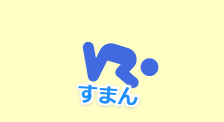
土下座しながら「すまん」
すまん
ソースコードを見る
HTMLコード
<div class="linestamp-04">
  <i class="fa-solid fa-person-praying"></i>
  <span class="text-04">すまん</span>
</div>
CSSコード
.linestamp-04 {
  position: relative;
  height: 120px;
  width: 120px;
  overflow: hidden;
}
.linestamp-04 i {
  position: absolute;
  font-size: 70px;
  color: #4169E1;
  left: 25px;
  bottom: 40px;
  animation: icon-animation-04 3s ease-in-out infinite;
}
.linestamp-04 .text-04 {
  position: absolute;
  bottom: 10px;
  left: 0;
  right: 0;
  text-align: center;
  font-weight: bold;
  font-size: 20px;
  color: #1E90FF;
  text-shadow: 2px 2px 1px #fff, -2px -2px 1px #fff, -2px 2px 1px #fff,
  2px -2px 1px #fff, 0 2px 1px #fff, 0 -2px 1px #fff, -2px 0 1px #fff,
  2px 0 1px #fff, 0 0 5px rgba(255, 255, 255, 0.7), 0 1px 4px #000;
  animation: text-04 0.1s ease-in-out infinite;
}
@keyframes icon-animation-04 {
  0% {
    transform: rotate(0deg) translate(-20px, 0);
  }
  6% {
    transform: rotate(80deg) translate(20px, -15px);
  }
  82% {
    transform: rotate(80deg) translate(20px, -15px);
  }
  100% {
    transform: rotate(0deg) translate(-20px, 0);
  }
}
@keyframes text-04 {
    0% {
        transform: translate(0px, 0px)
    }
    50% {
        transform: translate(0px, 0px) rotateZ(4deg)
    }
}
泣きわめく「やだやだやだ」
やだやだやだ
ソースコードを見る
HTMLコード
<div class="linestamp-05">
  <i class="fa-solid fa-face-tired"></i>
  <span class="text-05">やだやだやだ</span>
</div>
CSSコード
.linestamp-05 {
  position: relative;
  height: 120px;
  width: 120px;
  overflow: hidden;
}
.linestamp-05 i {
  position: absolute;
  font-size: 70px;
  color: #1E90FF;
  left: 25px;
  bottom: 35px;
  animation: icon-animation-05 0.15s ease-in-out infinite;
}
.linestamp-05 .text-05 {
  position: absolute;
  bottom: 10px;
  left: 0;
  right: 0;
  text-align: center;
  font-weight: bold;
  font-size: 16px;
  color: #FF8C00;
  text-shadow: 2px 2px 1px #fff, -2px -2px 1px #fff, -2px 2px 1px #fff,
  2px -2px 1px #fff, 0 2px 1px #fff, 0 -2px 1px #fff, -2px 0 1px #fff,
  2px 0 1px #fff, 0 0 5px rgba(255, 255, 255, 0.7), 0 1px 4px #000;
  animation: text-05 0.1s ease-in-out infinite;
}
@keyframes icon-animation-05 {
  0%, 100% {
    transform: translate(0, 0) rotate(0deg);
  }
  25% {
    transform: translate(-5px, -5px) rotate(-10deg);
  }
  50% {
    transform: translate(5px, 0) rotate(10deg);
  }
  75% {
    transform: translate(-5px, 5px) rotate(-5deg);
  }
}
@keyframes text-05 {
  0%, 100% {
    transform: translate(1px, 0) rotate(1deg);
  }
  50% {
    transform: translate(-1px, -1px) rotate(-2deg);
  }
}
キレながら「ゆるさん」
ゆるさん
絶対ゆるさんアレンジ
ゆるさん
アイコンを<i class="fa-solid fa-people-group"></i>にし、文字色とアイコン色を反転させると、状況の深刻さがアップします。
ソースコードを見る
HTMLコード
<div class="linestamp-06">
  <i class="fa-solid fa-face-angry"></i>
  <span class="text-06">ゆるさん</span>
</div>
CSSコード
.linestamp-06 {
  position: relative;
  height: 120px;
  width: 120px;
  overflow: hidden;
}
.linestamp-06 i {
  position: absolute;
  font-size: 70px;
  color: #FF4500;
  left: 25px;
  bottom: 35px;
  animation: icon-animation-06 0.1s ease-in-out infinite;
}
.linestamp-06 .text-06 {
  position: absolute;
  bottom: 15px;
  left: 0;
  right: 0;
  text-align: center;
  font-weight: bold;
  font-size: 18px;
  color: black;
  text-shadow: 2px 2px 1px #fff, -2px -2px 1px #fff, -2px 2px 1px #fff,
  2px -2px 1px #fff, 0 2px 1px #fff, 0 -2px 1px #fff, -2px 0 1px #fff,
  2px 0 1px #fff, 0 0 5px rgba(255, 255, 255, 0.7), 0 1px 4px #000;
  animation: text-06 1s ease-in-out infinite;
}
@keyframes icon-animation-06 {
  0%, 100% {
    transform: translate(0, 0) rotate(0deg);
  }
  25% {
    transform: translate(-2px, -2px) rotate(-2deg);
  }
  50% {
    transform: translate(2px, 2px) rotate(2deg);
  }
  75% {
    transform: translate(-2px, 2px) rotate(-2deg);
  }
}
@keyframes text-06 {
  0%,6%,12% { transform: translate(10px, 3px); }
  3%,9%,15% { transform: translate(-3px, -10px) rotate(-30deg); }
  18%,100% { transform: translate(0px, 0px); }
}
激しく「おぎゃあああ」
おぎゃあああ
ソースコードを見る
HTMLコード
<div class="linestamp-08">
  <i class="fa-solid fa-baby"></i>
  <span class="text-08">おぎゃあああ</span>
</div>
CSSコード
.linestamp-08 {
  position: relative;
  height: 120px;
  width: 120px;
  overflow: hidden;
}

.linestamp-08 i {
  position: absolute;
  font-size: 70px;
  color: #5AC9FF;
  left: 30px;
  top: 20px;
  animation: icon-animation-08 0.2s ease-in-out infinite;
}
.linestamp-08 .text-08 {
  position: absolute;
  bottom: 40px;
  left: 0;
  right: 0;
  text-align: center;
  font-weight: bold;
  font-size: 14px;
  color: #FF4A2A;
  text-shadow: 2px 2px 1px #fff, -2px -2px 1px #fff, -2px 2px 1px #fff,
  2px -2px 1px #fff, 0 2px 1px #fff, 0 -2px 1px #fff, -2px 0 1px #fff,
  2px 0 1px #fff, 0 0 5px rgba(255, 255, 255, 0.7), 0 1px 4px #000;
  animation: text-08 0.1s ease-in-out infinite;
}
.linestamp-08 .text-08::first-letter {
  font-size: 24px;
}
@keyframes icon-animation-08 {
  0%, 100% {
    transform: translate(0, 0) rotate(0deg);
  }
  25% {
    transform: translate(-4px, -4px) rotate(-5deg);
  }
  50% {
    transform: translate(4px, 4px) rotate(5deg);
  }
  75% {
    transform: translate(-4px, 4px) rotate(-5deg);
  }
}
@keyframes text-08 {
  0%, 100% {
    transform: translate(0, 0);
  }
  25% {
    transform: translate(-2px, 1px);
  }
  50% {
    transform: translate(2px, -1px);
  }
  75% {
    transform: translate(-1px, -1px);
  }
}
おぼれる「うわぁぁあ」
うわぁぁあ
ソースコードを見る
HTMLコード
<div class="linestamp-09">
<i class="fa-solid fa-person-drowning"></i>
  <span class="text-09">うわぁぁあ</span>
</div>
CSSコード
.linestamp-09 {
  position: relative;
  height: 120px;
  width: 120px;
  overflow: hidden;
}
.linestamp-09 i {
  position: absolute;
  font-size: 70px;
  color: #4169e1;
  left: 25px;
  bottom: 35px;
  animation: icon-animation-09 0.8s ease-in-out infinite;
}
.linestamp-09 .text-09{
  position: absolute;
  bottom: 20px;
  left: 0;
  right: 0;
  text-align: center;
  font-weight: bold;
  font-size: 20px;
  color: #1e90ff;
    text-shadow: 2px 2px 1px #fff, -2px -2px 1px #fff, -2px 2px 1px #fff,
  2px -2px 1px #fff, 0 2px 1px #fff, 0 -2px 1px #fff, -2px 0 1px #fff,
  2px 0 1px #fff, 0 0 5px rgba(255, 255, 255, 0.7), 0 1px 4px #000;
  animation: text-09 0.1s ease-in-out infinite;
}
@keyframes icon-animation-09 {
  0%,
  99.9%,
  50% {
    transform: scaleX(-1);
  }
  0.1%,
  100%,
  49.9% {
    transform: scaleX(1);
  }
}
@keyframes text-09 {
  0%, 100% {
    transform: translate(1px, -5px) rotate(2deg);
  }
  50% {
    transform: translate(-1px, -5px) rotate(-2deg);
  }
}
渦に飲まれる「うわぁぁあ」
うわぁぁあ
ソースコードを見る
HTMLコード
<div class="linestamp-10">
<i class="fa-solid fa-person-drowning"></i>
  <span class="text-10">うわぁぁあ</span>
</div>
CSSコード
.linestamp-10 {
  position: relative;
  height: 120px;
  width: 120px;
  overflow: hidden;
}
.linestamp-10 i {
  position: absolute;
  font-size: 70px;
  color: #4169e1;
  left: 25px;
  bottom: 35px;
  animation: icon-animation-10 0.8s ease-in-out infinite;
}
.linestamp-10 .text-10 {
  position: absolute;
  bottom: 20px;
  left: 0;
  right: 0;
  text-align: center;
  font-weight: bold;
  font-size: 20px;
  color: #1e90ff;
    text-shadow: 2px 2px 1px #fff, -2px -2px 1px #fff, -2px 2px 1px #fff,
  2px -2px 1px #fff, 0 2px 1px #fff, 0 -2px 1px #fff, -2px 0 1px #fff,
  2px 0 1px #fff, 0 0 5px rgba(255, 255, 255, 0.7), 0 1px 4px #000;
  animation: text-10 0.1s ease-in-out infinite;
}
@keyframes icon-animation-10 {
  0%,100%{
    transform: scaleX(-1);
  }
  50% {
    transform: scaleX(1);
  }
}
@keyframes text-10 {
  0%, 100% {
    transform: translate(0, 0);
  }
  25% {
    transform: translate(-2px, 1px);
  }
  50% {
    transform: translate(2px, -1px);
  }
  75% {
    transform: translate(-1px, -1px);
  }
}